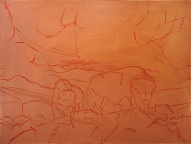
 I begin by mixing the same "rust" color I used to tone the canvas - a mixture of equal parts cadmium yellow light, alizarin crimson and a dab of ultramarine blue. I used this mixture, in combination with a small stiff bristle brush, to draw out the composition. As you can see, I don't make a detailed drawing. In fact, it isn't much more detailed than the rough sketch. I am only concerned with getting the most important landmarks of the composition placed and establishing a general guide for spatial and size relationships. This took about 15 minutes.
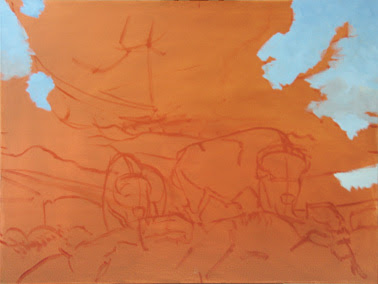 Once the drawing is finished, I then begin blocking in color. As a generalization, I work background to foreground, top to bottom. This isn't always the case, but for the most part it is how I tend to work. Here I've started blocking in the sky using a mixture of cerulean blue, a little ultramarine blue and a dab of alizarin crimson and cadmium yellow light to gray it down just a bit. I then lay in the color, mixing a bit more titanium white with it as I move down the painting.
To create interest in areas (like the sky) where there are large blocks of flat color, I really like to emphasize my brush strokes, varying the direction and length of them while being careful not to blend them out. This will create a textural quality that adds interest to an otherwise flat area of color. Also, I tend to try and paint as thickly as I can. This serves three purposes; first, when the piece is finished, the thick paint creates a jewel like quality when lighted. Second, the clarity of my colors and definition of my brush strokes are more apparent with the thicker paint. And finally, the thick paint allows me to ‘sculpt’ in a way, creating a 3-dimensional surface quality that helps to strengthen the appearance of depth in the painting.
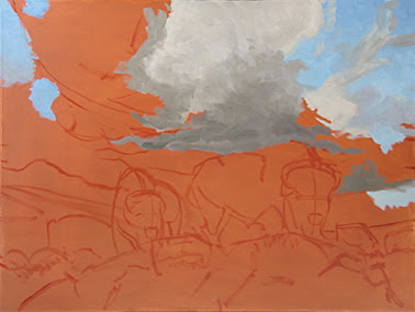 Here I have began blocking in the clouds. As the large foreground cloud goes darker (towards the base of the thunderhead) my color goes more purple, as I move to lighter areas of the cloud, my color goes more yellow. I never use straight white. I always mix it with something depending on what I want the color temperature of my light area's to be — in this case, the light areas of the clouds will be a mixture of cadmium yellow light and titanium white (warm). This mixture is applied to the brightest parts of my foreground clouds. As the clouds move further back on the horizon, I will paint the highlights of those clouds using more alizarin crimson. I will also gray them down a bit so that the difference between their highlights and their shadows is diminished. This will help to create atmospheric depth.
My brush strokes in the cloud are still apparent but I do blend them out slightly more than I do in the flat areas of the sky. This helps to soften the cloud and create contrast of texture between the clouds and the sky.
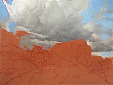 At this stage I am continuing to do what I have been — blocking in color. As the cloud begins to take shape, I also begin adding more subtlety of value.
NOTE: If you've never worked with a brightly toned canvas, it's important to consider that you may need to mix and compare colors on your palette and not on your canvas. The bright color will throw off your perception of any particular color's accuracy. So I would recommend getting your color correct on your pallet by comparing it with the other colors on your palette before putting it on the canvas. If its value and hue are correct on your palette, it will be correct on your canvas — even if it doesn't look accurate at first when placed against the brightly toned canvas.
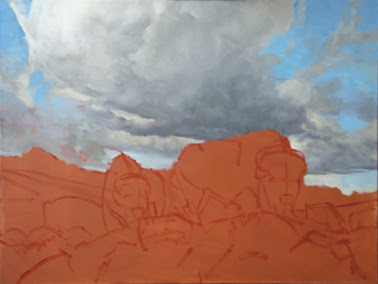 At this point, the sky is a little over halfway finished. I will continue to add subtle changes in value in the clouds as well as finish filling in the areas of the sky still absent of color. Once I complete the sky, I will let it dry before moving on to the foreground elements.
Up to the point of this last image, I've been working for about 6 hours. I've used only 2 brushes — a number 12 bristle flat and a number 10 bristle flat. Also, because Holbein paints come out of the tube slightly more stiff than I like, I mix a very small amount of liquin with each color — just enough to get the paint to flow a little better when applied to the canvas.
If you have any questions about this part of the demonstration, just post them here. I'll answer them as soon as I can.
I hope you've enjoyed the second part of my demonstration. I'll post the third part following this weekend.

Dustin, it's both interesting and informative to see your step-by-step process. Thanks for sharing.
ReplyDelete